Following Karl’s approach, we show some examples of plot styles we should avoid, explain how to improve them, and use these as motivation for a list of principles.
We compare and contrast plots that follow these principles to those that don’t.
Data visualization principles
The principles are mostly based on research related to how humans detect patterns and make visual comparisons.
The preferred approaches are those that best fit the way our brains process visual information.
When deciding on a visualization approach, it is also important to keep our goal in mind.
Data visualization principles
We may be comparing a
Viewable number of quantities.
Describing distributions for categories or numeric values.
Comparing the data from two groups.
Describing the relationship between two variables.
Encoding data using visual cues
We start by describing some principles for visually encoding numerical values:
aligned lengths
position
angles
area
brightness
color hue
Encoding data using visual cues
Example:
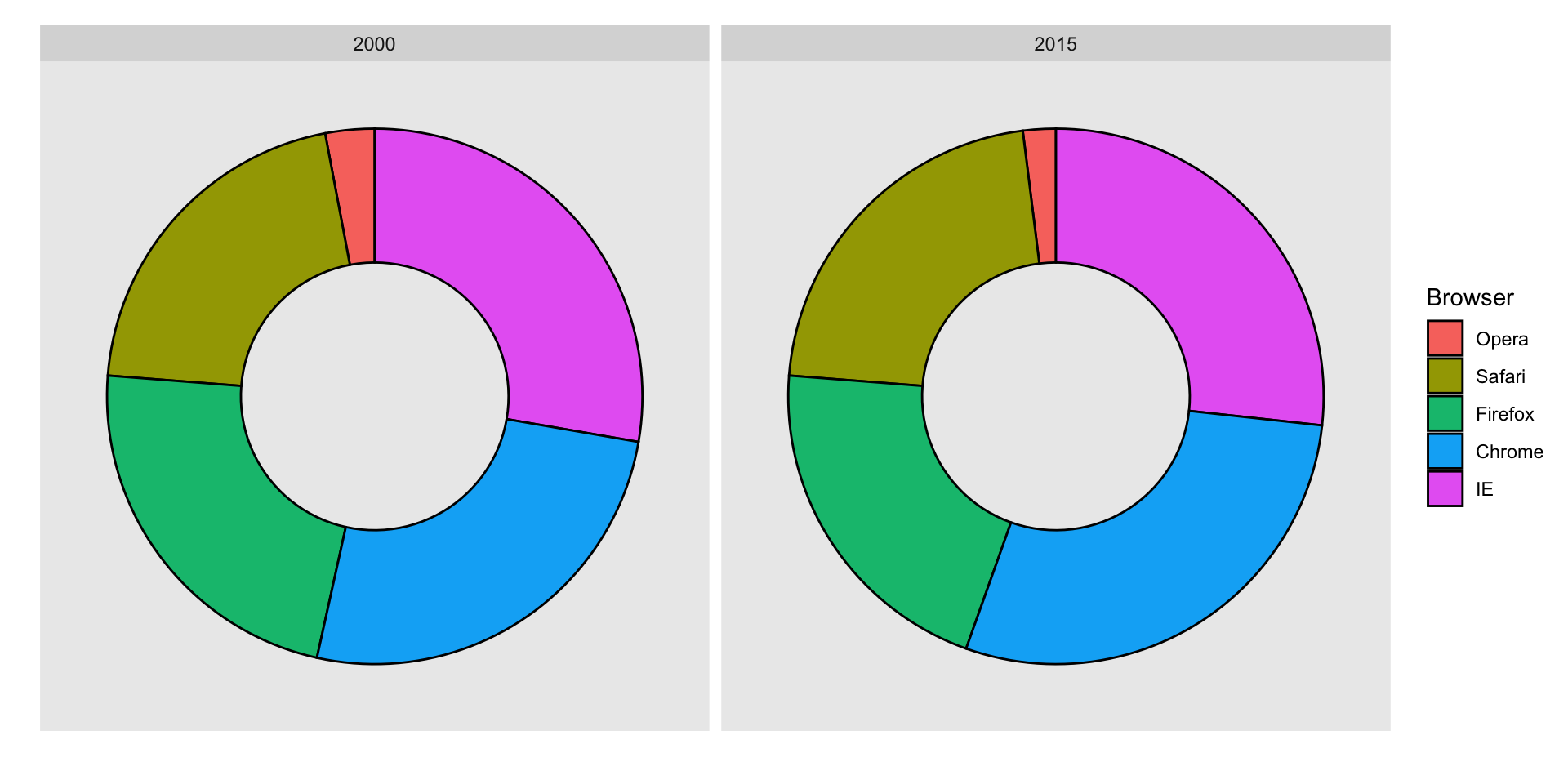
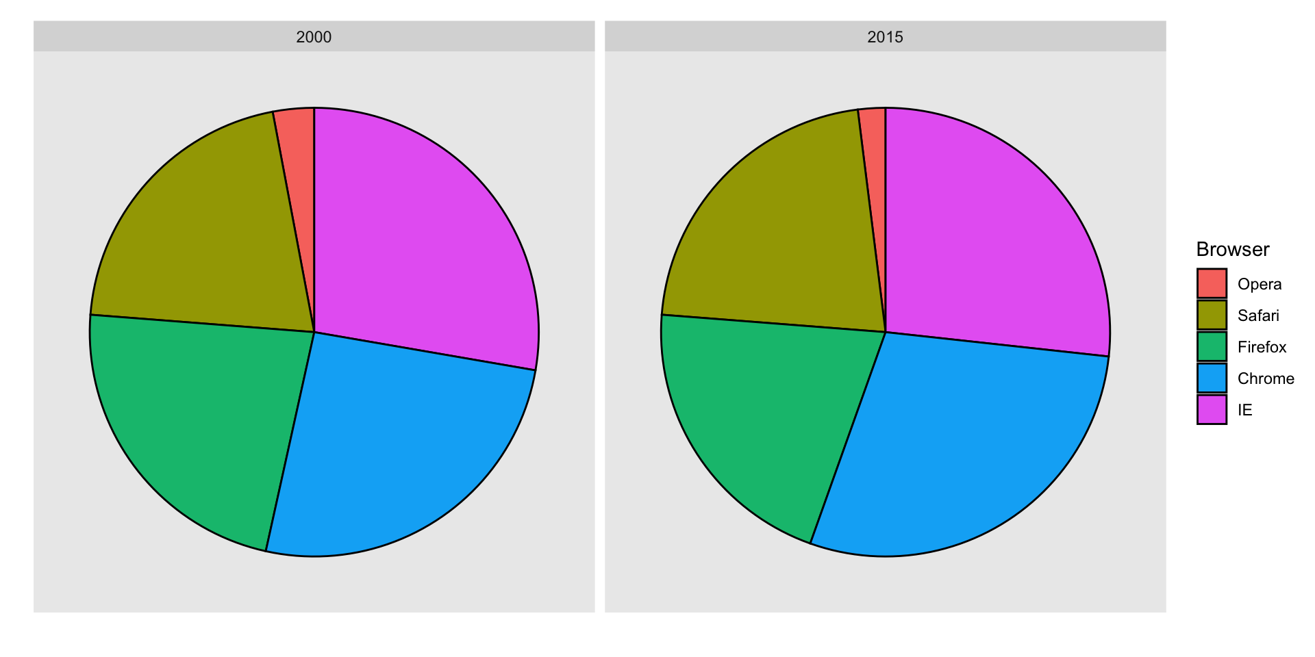
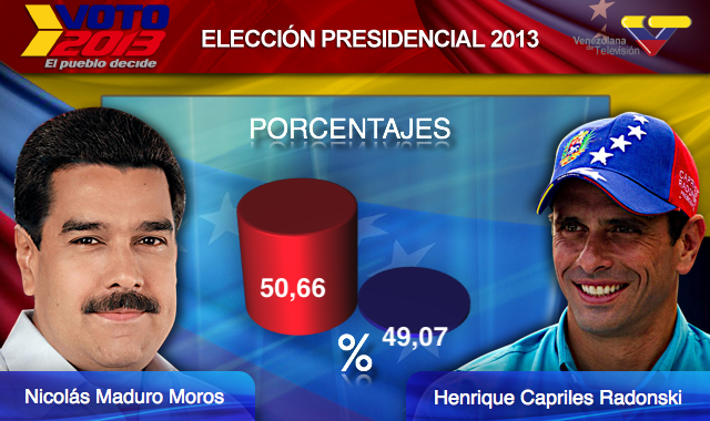
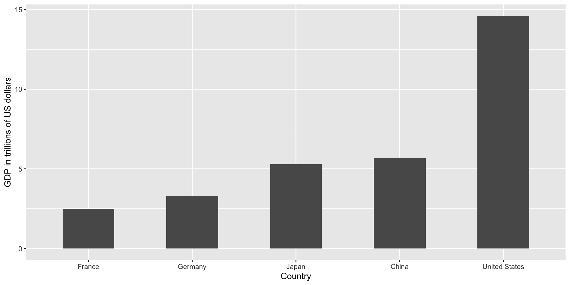
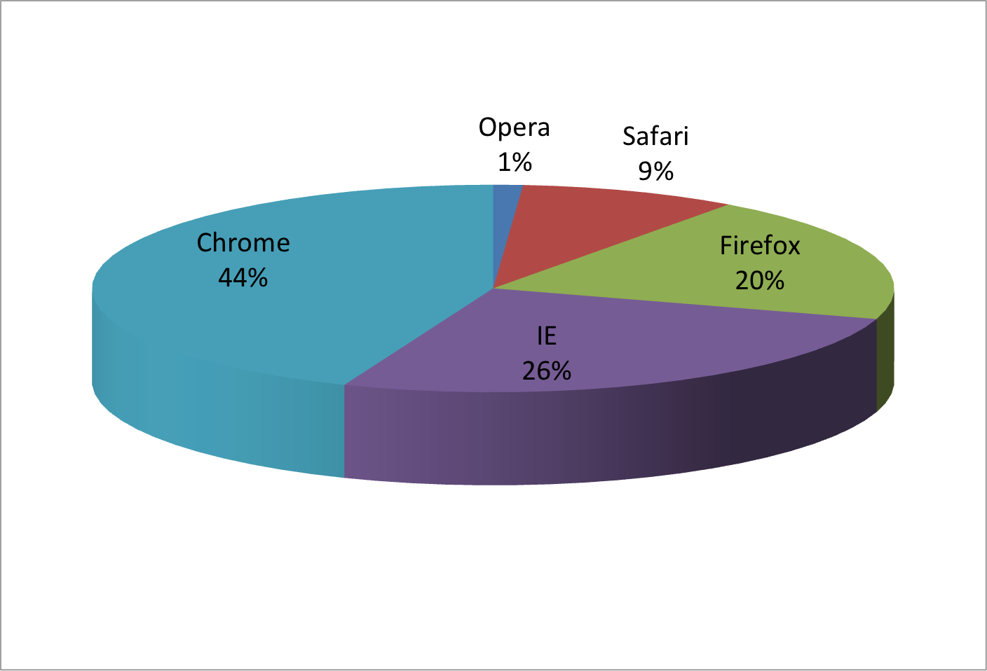
Suppose we want to report the results from two hypothetical polls regarding browser preference taken in 2000 and then 2015.
For each year, we are simply comparing five quantities – the five percentages for Opera, Safari, Firefox, IE, and Chrome.
Encoding data using visual cues
A widely used graphical representation of percentages, popularized by Microsoft Excel, is the pie chart:
Encoding data using visual cues
Here we are representing quantities with both areas and angles, since both the angle and area of each pie slice are proportional to the quantity the slice represents.
This turns out to be a sub-optimal choice since, as demonstrated by perception studies, humans are not good at precisely quantifying angles and are even worse when area is the only available visual cue.
Encoding data using visual cues
The donut chart uses only area:
Compare 2000 to 2015
Can you determine the actual percentages and rank the browsers’ popularity?
Can you see how they changed from 2000 to 2015?
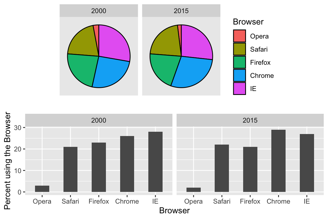
Show the numbers
A better approach is to simply show the numbers. It is not only clearer, but would also save on printing costs if printing a paper copy:
Browser
2000
2015
Opera
3
2
Safari
21
22
Firefox
23
21
Chrome
26
29
IE
28
27
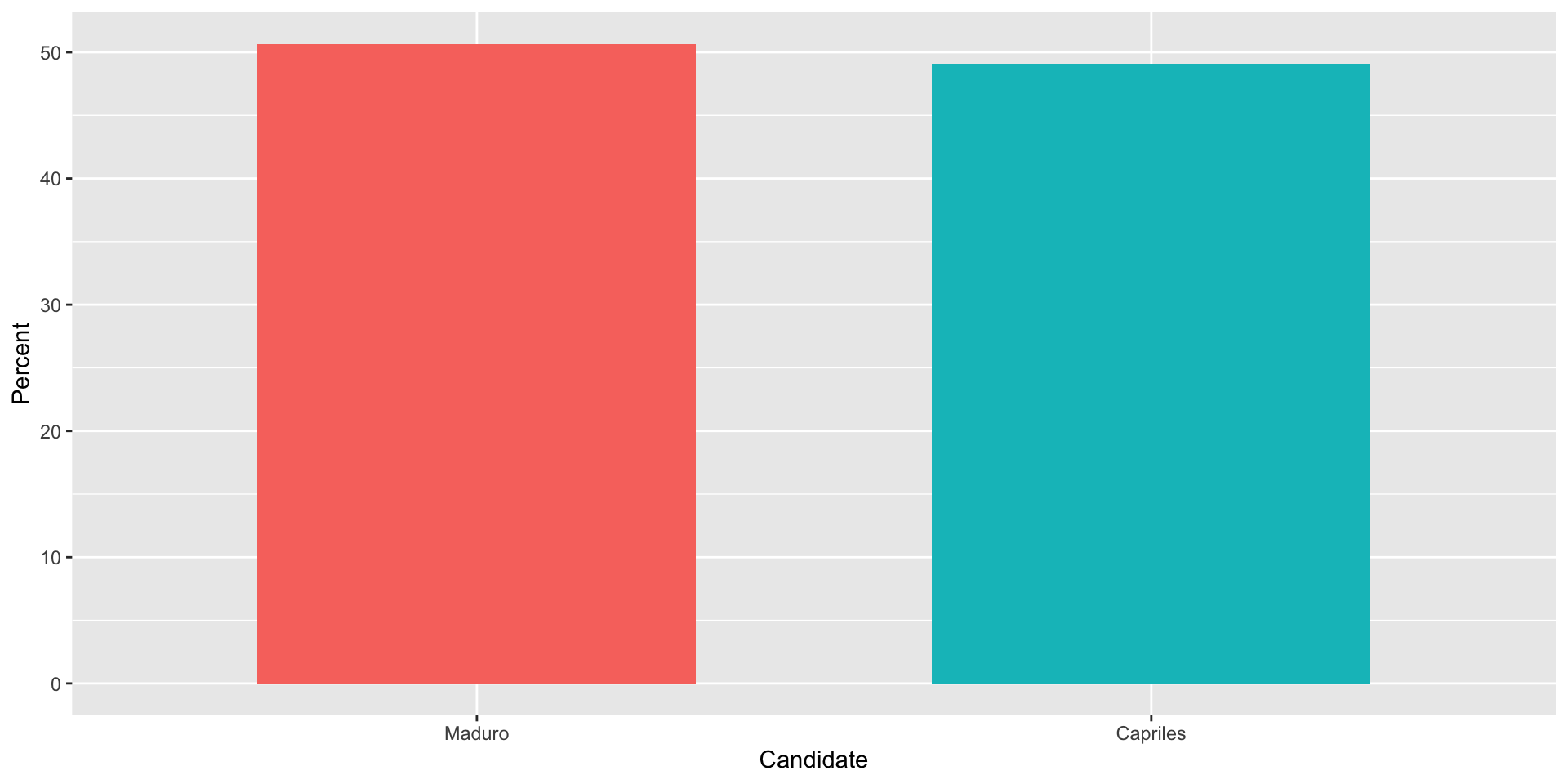
Barplots
Length is the best visual cue:
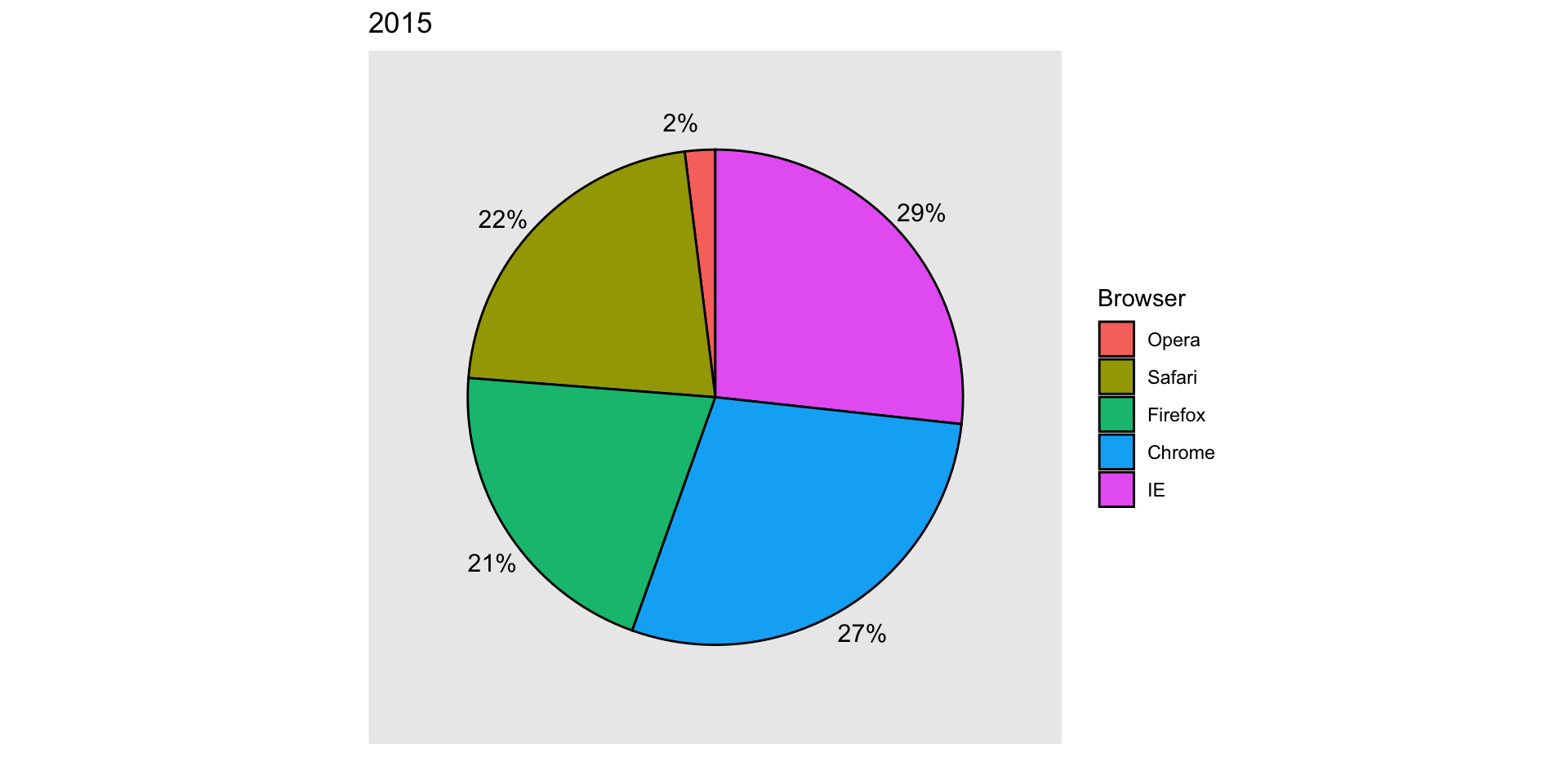
If foreced to make a pie chart
Label each pie slice with its respective percentage so viewers do not have to infer them:
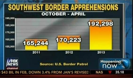
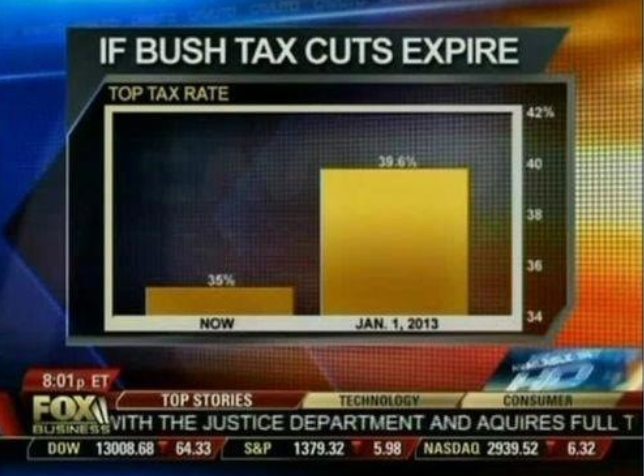
Know when to include 0
When using barplots, it is misinformative not to start the bars at 0.
This is because, by using a barplot, we are implying the length is proportional to the quantities being displayed.
By avoiding 0, relatively small differences can be made to look much bigger than they actually are.
This approach is often used by politicians or media organizations trying to exaggerate a difference.
Know when to include 0
Below is an illustrative example used by Peter Aldhous in this lecture.
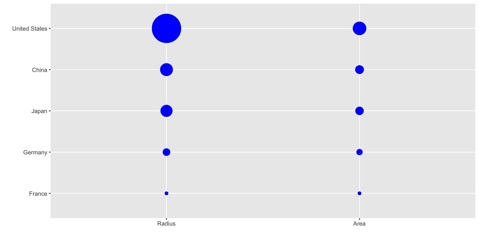
ggplot2 defaults to using area rather than radius.
Of course, in this case, we really should be using length:
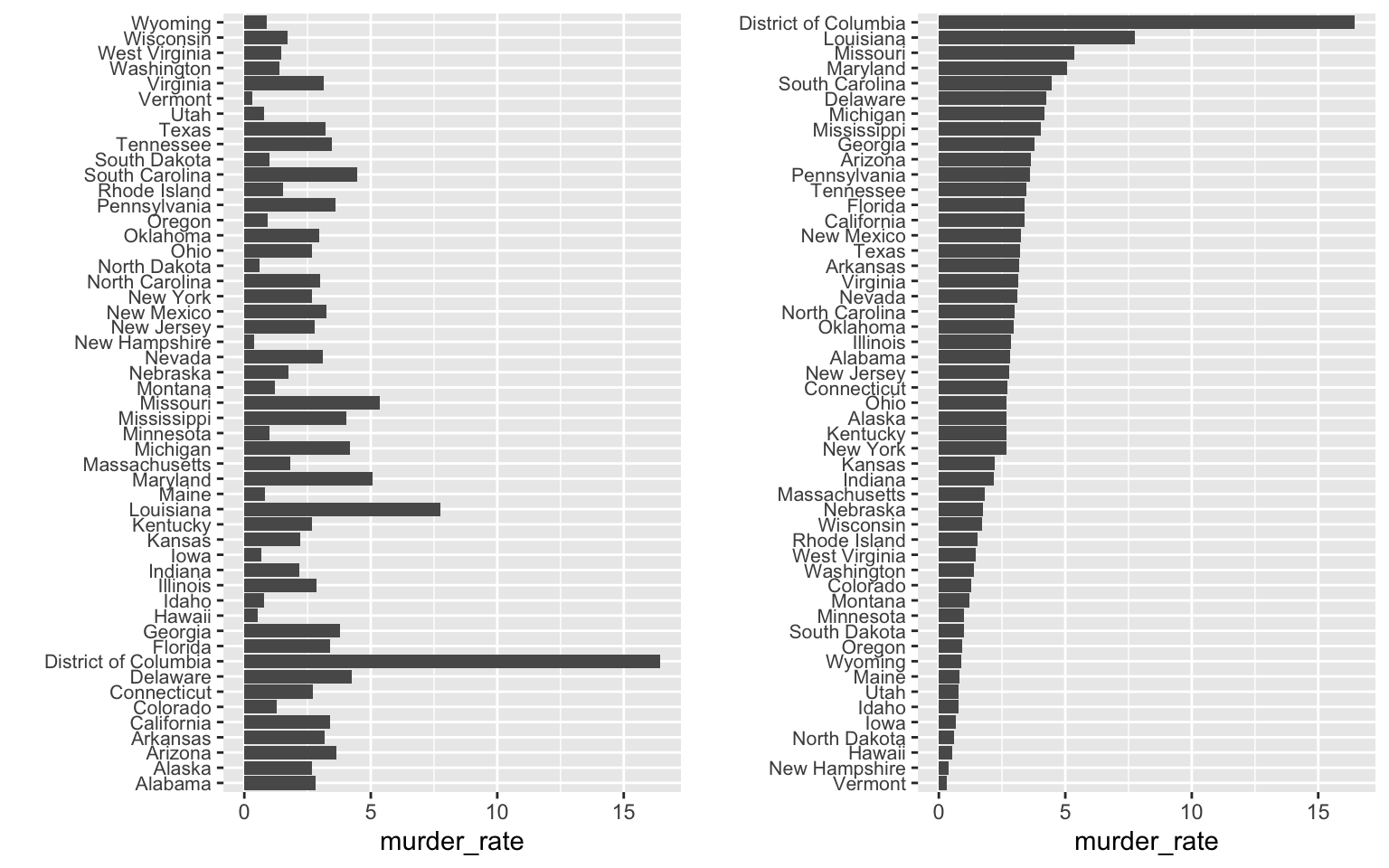
Order categories by a meaningful value
When one of the axes is used to show categories the default ggplot2 behavior is to order the categories alphabetically when they are defined by character strings.
If they are defined by factors, they are ordered by the factor levels.
We rarely want to use alphabetical order.
Instead, we should order by a meaningful quantity.
Order categories by a meaningful value
Note that the plot on the right is more informative:
Order categories by a meaningful value
Here is another example:
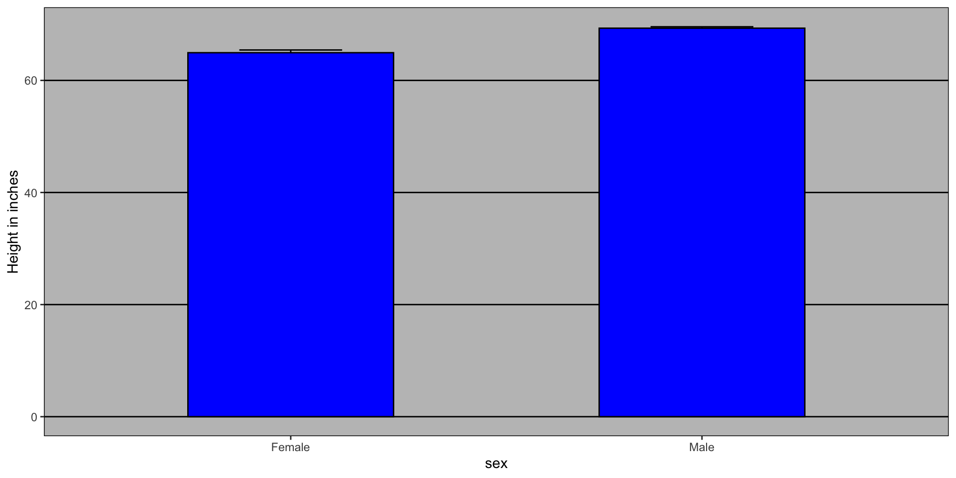
Show the data
We have focused on displaying single quantities across categories. We now shift our attention to displaying data, with a focus on comparing groups.
Suppose we want to describe height data to an extra-terrestrial.
Show the data
A commonly used plot, popularized by Microsoft Excel, is a barplot like this:
Show the data
Show the data
Use jitter to avoid over-plotting
Histograms
Since there are so many points, it is more effective to show distributions rather than individual points. We therefore show histograms for each group:
Ease comparisons
Use common axes
If horizontal comparison, stack graphs vertically
If vertical comparison, stack graphs horizontally
Stack vertically
Same axis
Boxplot is vertical
Stack horizontally
Contrast and compare
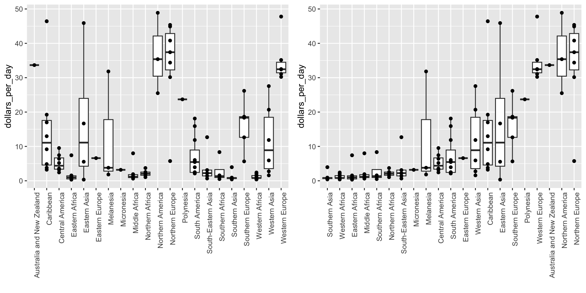
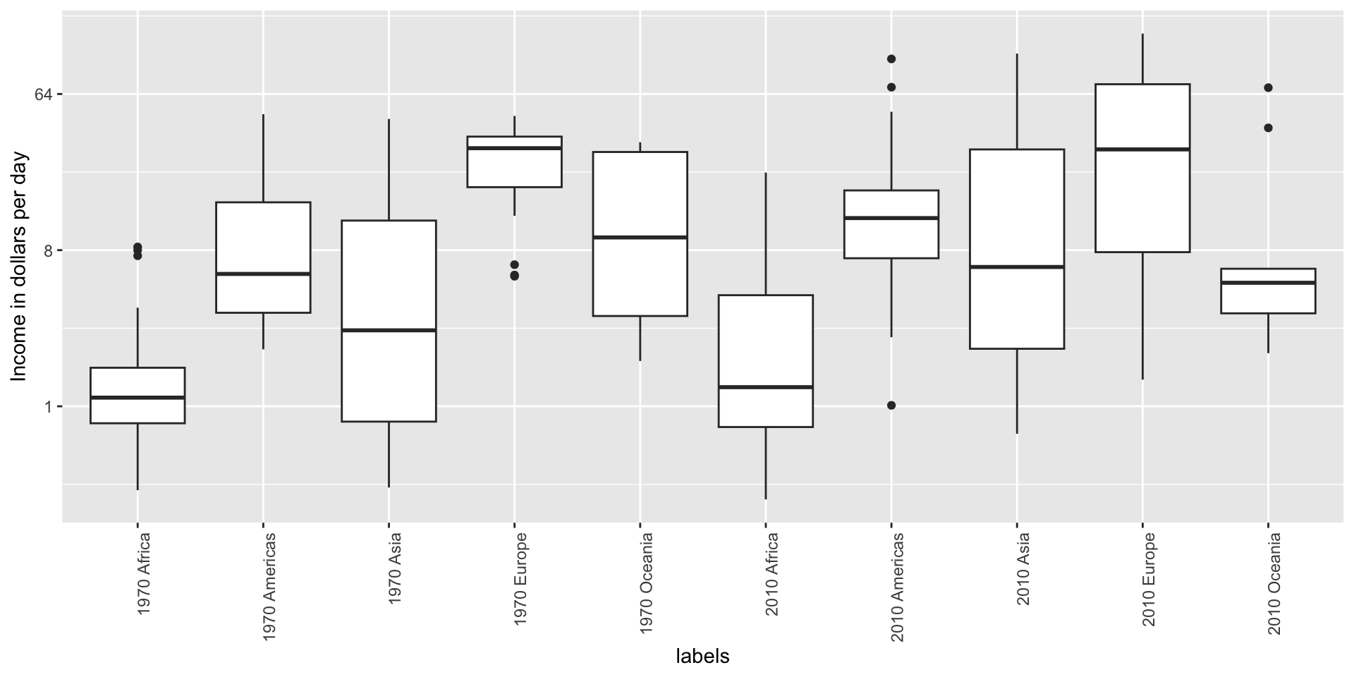
Consider transformations
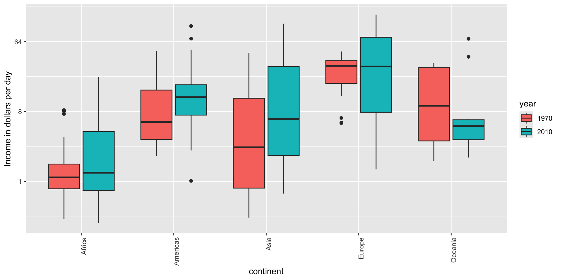
Here is a terrible plot comparing population across continents
Two countries drive average
Transformations
Here a log transformation provides a much more informative plot:
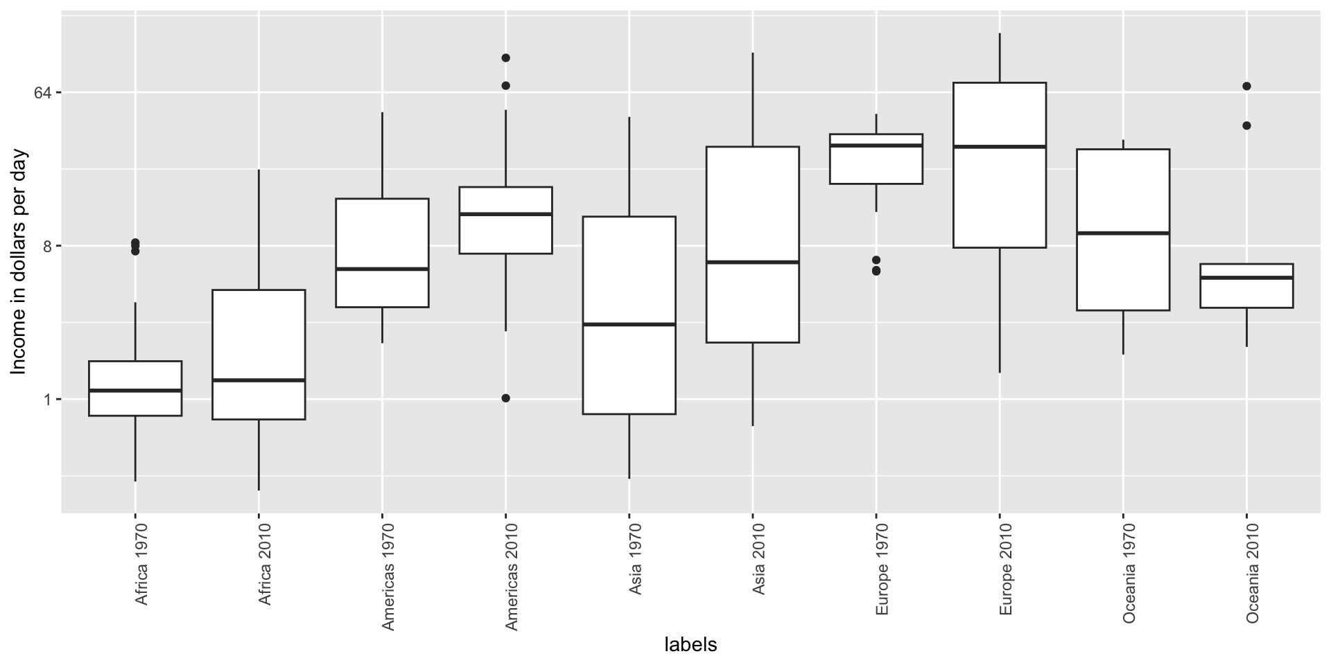
Visual cues to be compared should be adjacent
Note that it is hard to compare 1970 to 2020 by country:
Visual cues to be compared should be adjacent
Much easier if they are adjacent
Use color
The comparison becomes even easier to make if we use color to denote the two things we want to compare:
Think of the color blind
Approximately 1 in 12 men (8%) and 1 in 200 women (0.5%) worldwide are color blind.
The most common type of color blindness is red-green color blindness, which affects around 99% of all color blind individuals.
The prevalence of blue-yellow color blindness and total color blindness (achromatopsia) is much lower.
An example of how we can use a color blind friendly palette is described here.
Think of the color blind
Example of color-blind-friendly color palette:
Plots for two variables
In general, you should use scatterplots to visualize the relationship between two variables.
However, there are some exceptions.
We describe two alternative plots here:
slope chart
Bland-Altman plot
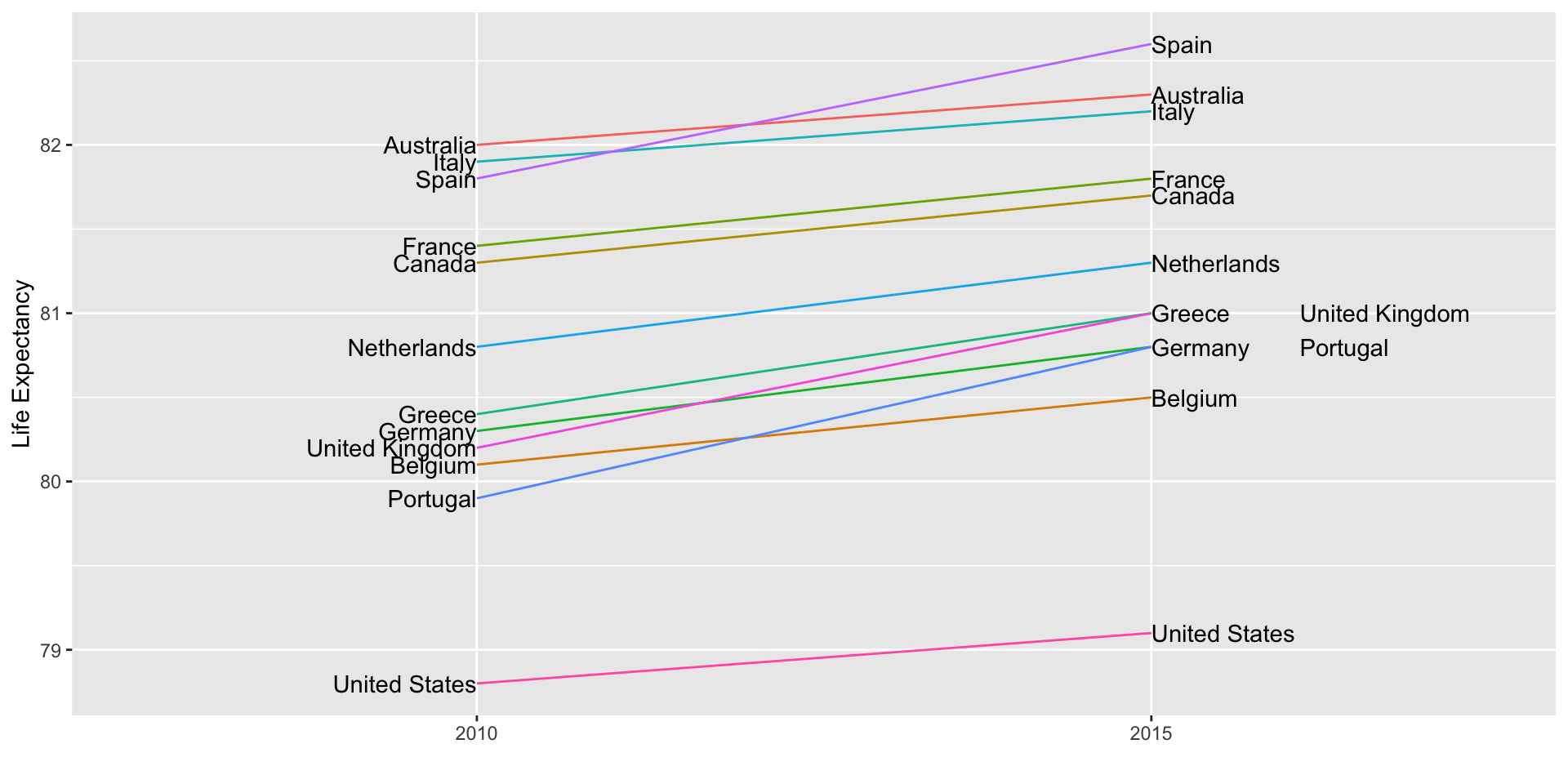
Slope charts
Slope charts adds angle as a visual cue, useful when comparing two groups and each element across two variables, such as years.
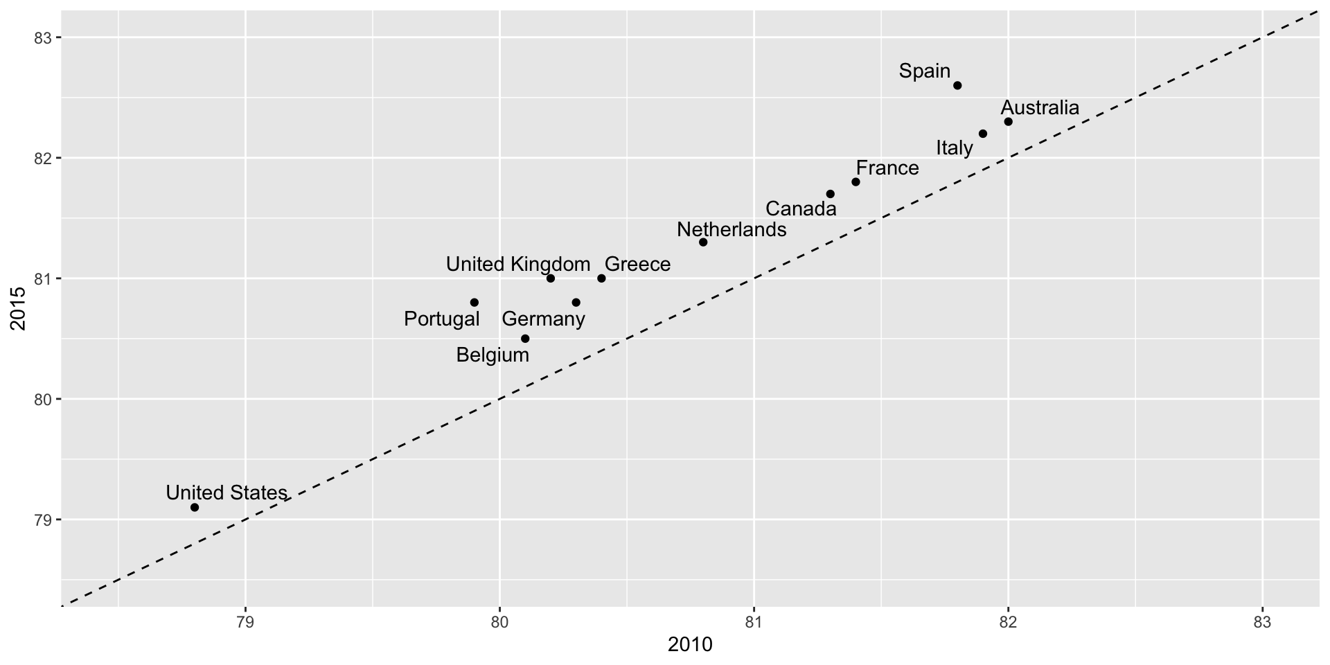
Scatterplot version
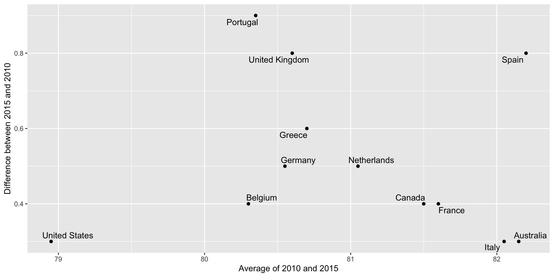
Bland-Altman plot
Shows difference in the y-axis and average on the x-axis.
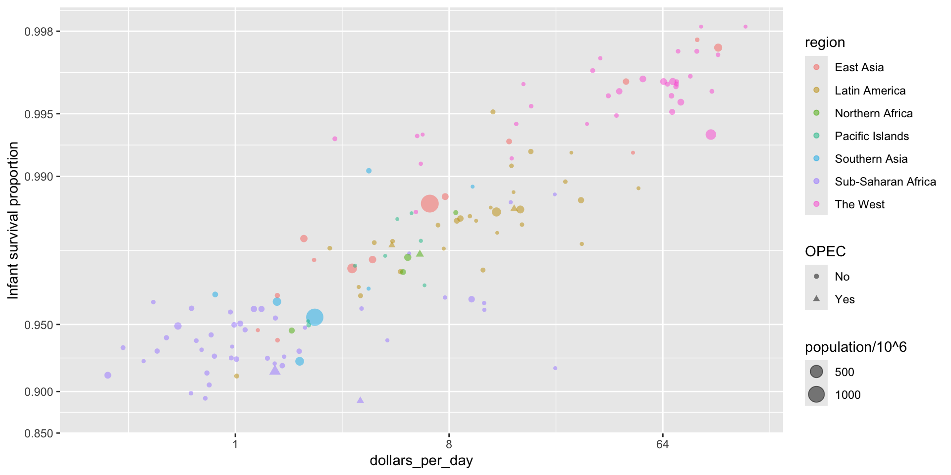
Encoding a third variable
We can use
different colors or shapes for categoris
areas, brightness or hue for continuous values
Encoding a third variable
We encode OPEC membership, region, and population.
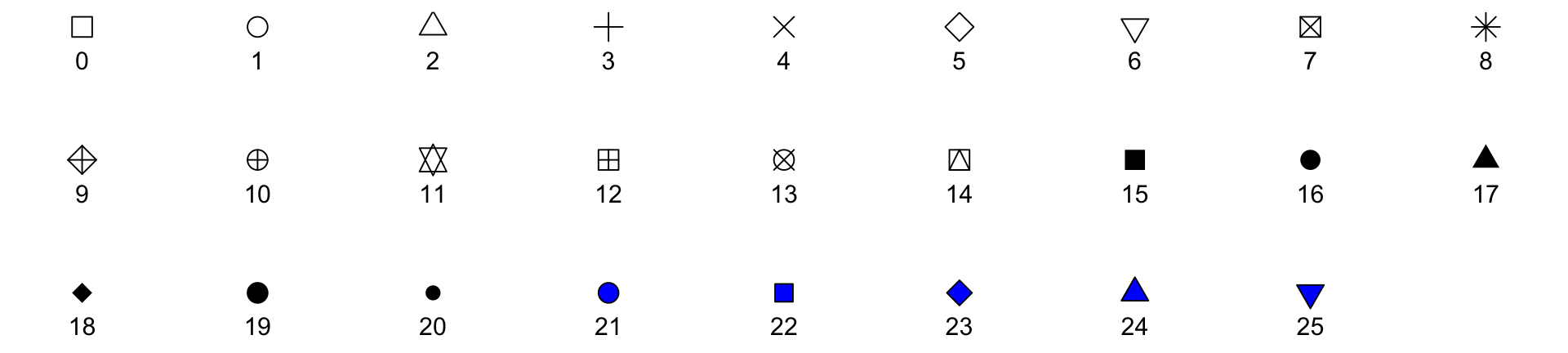
Point shapes available in R
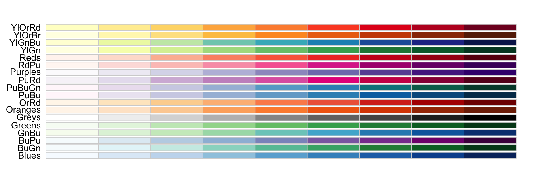
Using intensity or hue
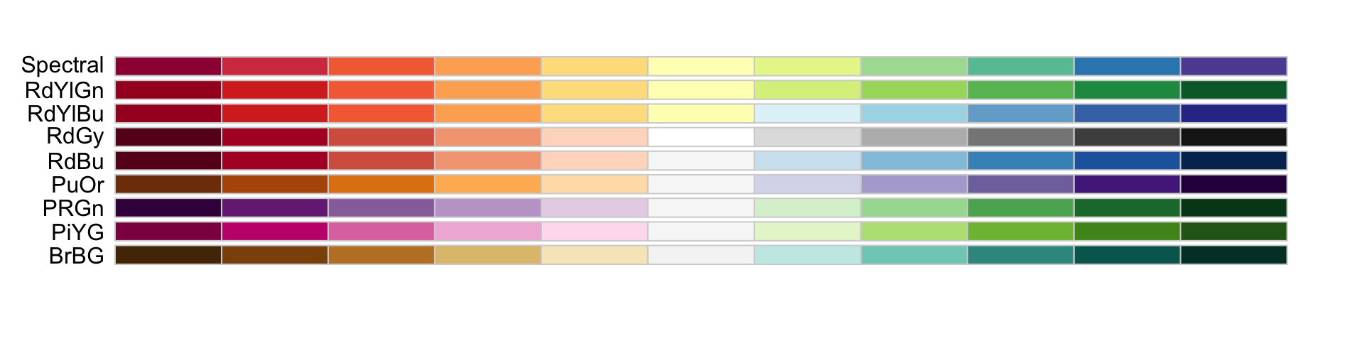
When selecting colors to quantify a numeric variable, we choose between two options: sequential and diverging.
Sequential colors
Sequential colors are suited for data that goes from high to low. High values are clearly distinguished from low values. Here are some examples offered by the package RColorBrewer:
Diverging colors
Diverging colors are used to represent values that diverge from a center. We put equal emphasis on both ends of the data range: higher than the center and lower than the center.
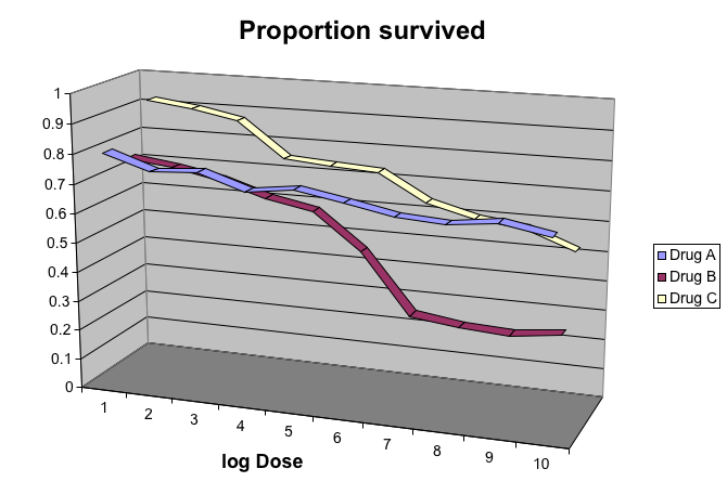
Avoid pseudo-3D plots
The figure below, taken from the scientific literature, shows three variables: dose, drug type and survival:
Avoid pseudo-3D plots
Humans are not good at seeing in three dimensions and our limitation is even worse with regard to pseudo-three-dimensions.
Avoid pseudo-3D plots
When does the purple ribbon intersects the red?
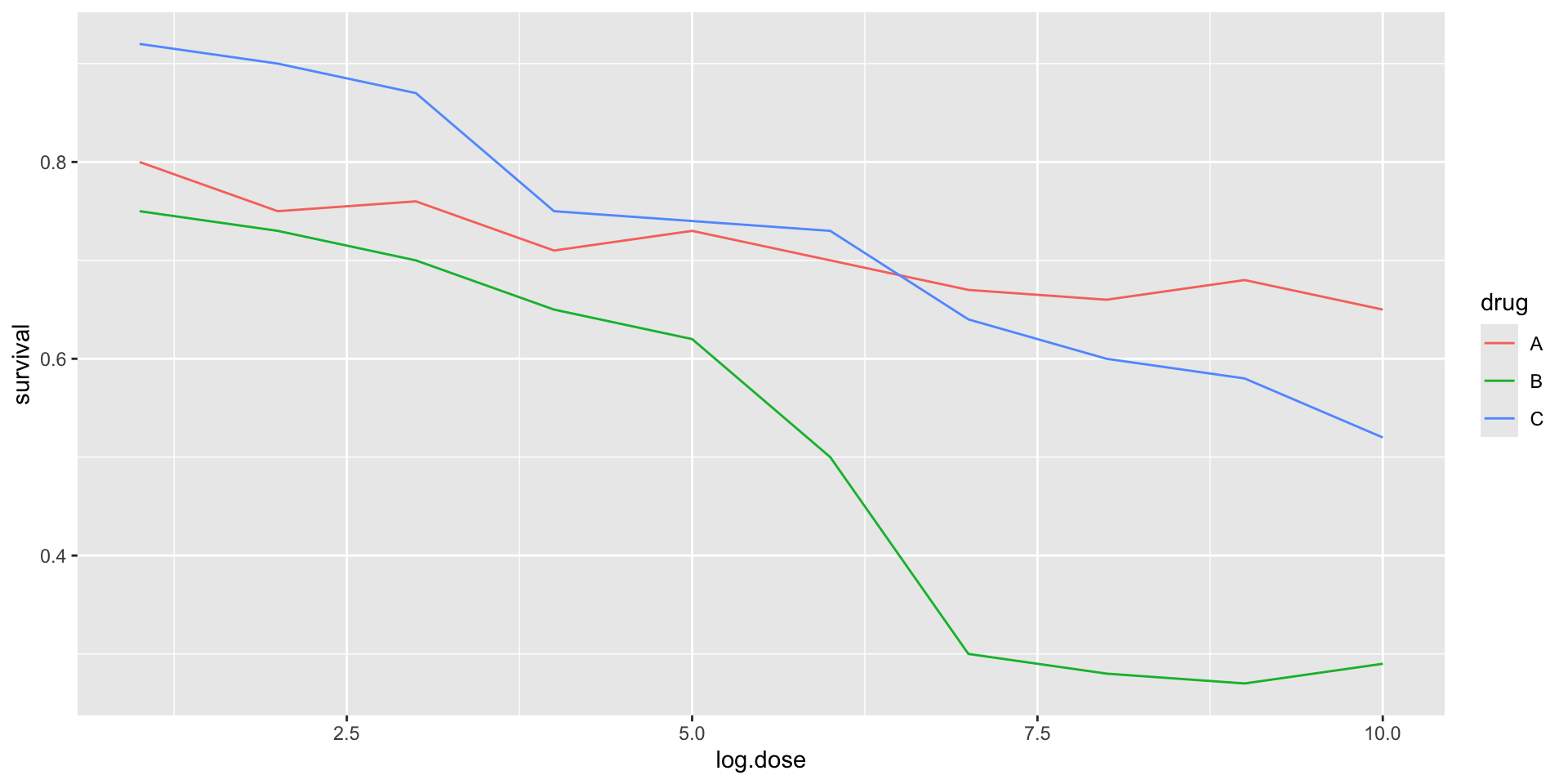
Avoid pseudo-3D plots
Color is enough to represent the categorical variable:
Avoid pseudo-3D plots
Pseudo-3D is sometimes used completely gratuitously: plots are made to look 3D even when the 3rd dimension does not represent a quantity. This only adds confusion and makes it harder to relay your message. We show two examples:
Avoid pseudo-3D plots
(Images courtesy of Karl Broman)
Avoid too many significant digits
By default, statistical software like R returns many significant digits.
The default behavior in R is to show 7 significant digits.
That many digits often adds no information and the added visual clutter can make it hard for the viewer to understand the message.
Avoid too many significant digits
As an example, here are the per 10,000 disease rates, computed from totals and population in R, for California across the five decades:
state
year
Measles
Pertussis
Polio
California
1940
37.8826320
18.3397861
0.8266512
California
1950
13.9124205
4.7467350
1.9742639
California
1960
14.1386471
NA
0.2640419
California
1970
0.9767889
NA
NA
California
1980
0.3743467
0.0515466
NA
Avoid too many significant digits
We are reporting precision up to 0.00001 cases per 10,000, a very small value in the context of the changes that are occurring across the dates.
state
year
Measles
Pertussis
Polio
California
1940
37.8826320
18.3397861
0.8266512
California
1950
13.9124205
4.7467350
1.9742639
California
1960
14.1386471
NA
0.2640419
California
1970
0.9767889
NA
NA
California
1980
0.3743467
0.0515466
NA
Avoid too many significant digits
In this case, one decimal point is more than enough and clearly makes the point that rates are decreasing:
state
year
Measles
Pertussis
Polio
California
1940
37.9
18.3
0.8
California
1950
13.9
4.7
2.0
California
1960
14.1
NA
0.3
California
1970
1.0
NA
NA
California
1980
0.4
0.1
NA
Avoid too many significant digits
Useful ways to change the number of significant digits or to round numbers are
signif
round
You can define the number of significant digits globally by setting options like this: options(digits = 3).
Values compared in columns
Another principle related to displaying tables is to place values being compared on columns rather than rows. Compare these two presentations:
state
disease
1940
1950
1960
1970
1980
California
Measles
37.9
13.9
14.1
1
0.4
California
Pertussis
18.3
4.7
NA
NA
0.1
California
Polio
0.8
2.0
0.3
NA
NA
Values compared in columns
Another principle related to displaying tables is to place values being compared on columns rather than rows. Compare these two presentations:
state
year
Measles
Pertussis
Polio
California
1940
37.9
18.3
0.8
California
1950
13.9
4.7
2.0
California
1960
14.1
NA
0.3
California
1970
1.0
NA
NA
California
1980
0.4
0.1
NA
Know your audience
Graphs can be used for
our own exploratory data analysis,
to convey a message to experts, or
to help tell a story to a general audience.
Make sure that the intended audience understands each element of the plot.
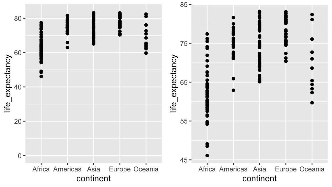
Visualizing data distributions
Summarizing complex datasets is crucial in data analysis, allowing us to share insights drawn from the data more effectively.
One common method is to use the average value to summarize a list of numbers.
For instance, a high school’s quality might be represented by the average score in a standardized test.
Sometimes, an additional value, the standard deviation, is added.
Visualizing data distributions
So, a report might say the scores were 680 \(\pm\) 50, boiling down a full set of scores to just two numbers.
But is this enough? Are we overlooking crucial information by relying solely on these summaries instead of the complete data?
Our first data visualization building block is learning to summarize lists of numbers or categories.
More often than not, the best way to share or explore these summaries is through data visualization.
Visualizing data distributions
The most basic statistical summary of a list of objects or numbers is its distribution.
Once a data has been summarized as a distribution, there are several data visualization techniques to effectively relay this information.
Understanding distributions is therefore essential for creating useful data visualizations.
Note: understanding distributions is also essential for understanding inference and statistical models
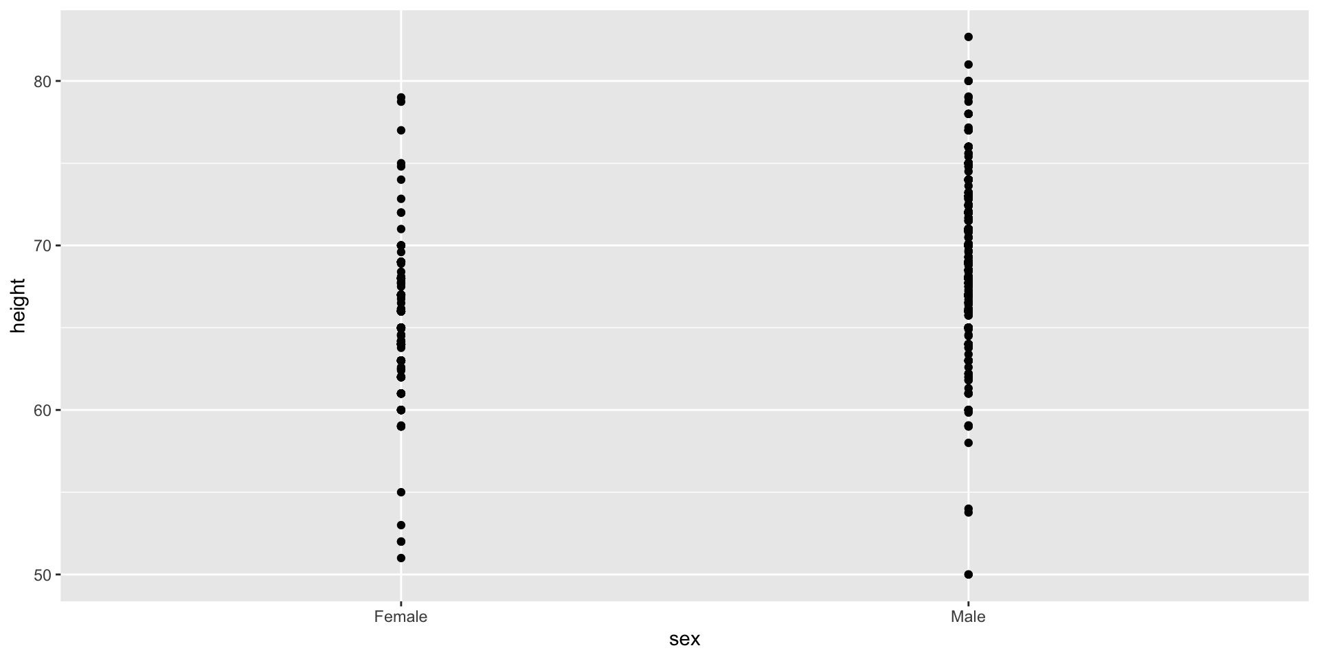
Case study: describing student heights
Pretend that we have to describe the heights of our classmates to someone that has never seen humans.
We ask students to report their height in inches.
We also ask them to report sex because there are two different height distributions.
     sex height
1   Male     75
2   Male     70
3   Male     68
4   Male     74
5   Male     61
6 Female     65
Case study
One way to convey the heights to ET is to simply send him this list of 1,050 heights.
But there are much more effective ways to convey this information, and understanding the concept of a distribution will be key.
To simplify the explanation, we first focus on male heights.
We examine the female height data later.
Distributions
The most basic statistical summary of a list of objects or numbers is its distribution.
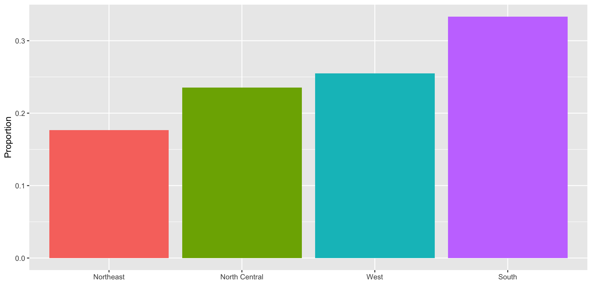
For example, with categorical data, the distribution simply describes the proportion of each unique category:
Female   Male
 0.227  0.773
Distributions
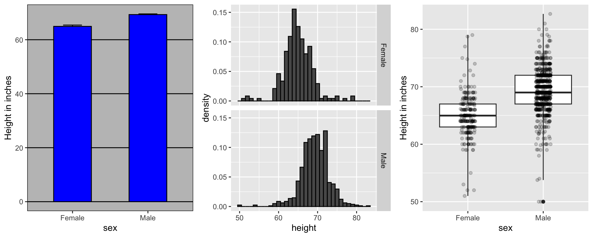
To visualize this we simply use a barplot.
Here is an example with US state regions:
Histograms
When the data is numerical, the task of displaying distributions is more challenging.
When data is not categorical, reporting the frequency of each entry, as we did for categorical data, is not an effective summary since most entries are unique.
For example, in our case study, while several students reported a height of 68 inches, only one student reported a height of 68.503937007874 inches and only one student reported a height 68.8976377952756 inches.
Histograms
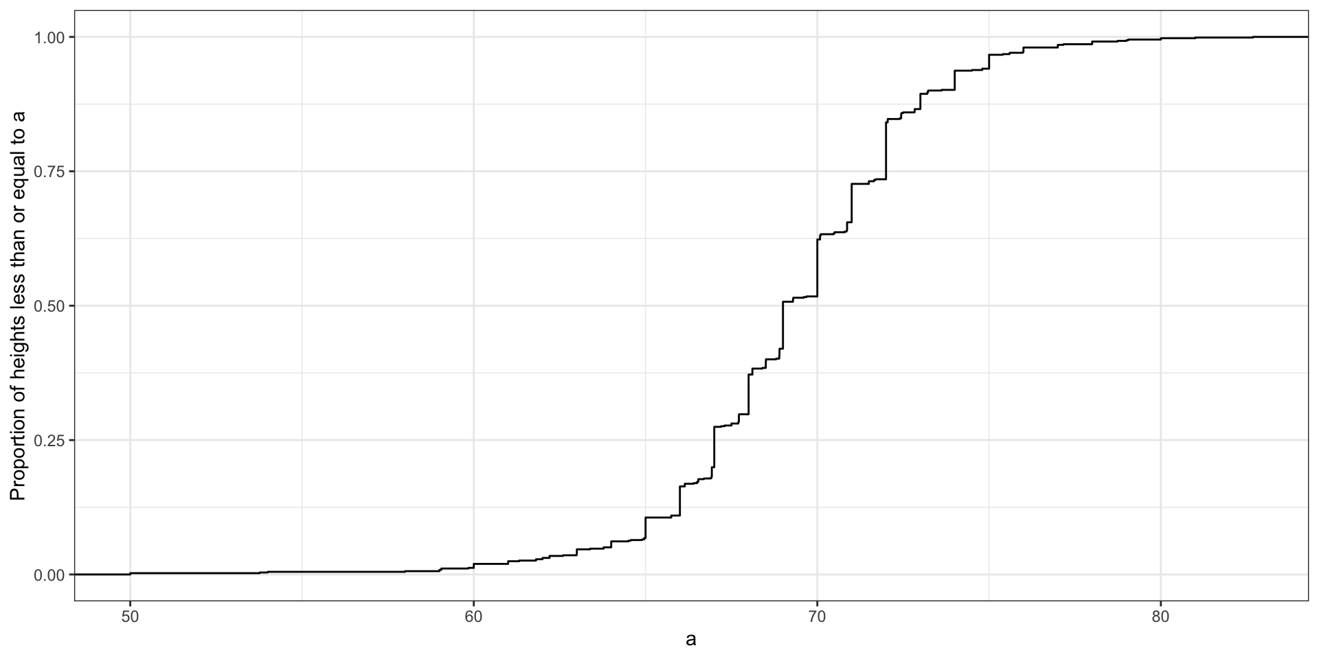
A more useful way to define a distribution for numeric data is to define a function that reports the proportion of the data below \(a\) for all possible values of \(a\).
This function is called the empirical cumulative distribution function (eCDF), it can be plotted, and it provides a full description of the distribution of our data.
Histograms
Here is the eCDF for male student heights:
Histograms
However, summarizing data by plotting the eCDF is actually not very popular in practice.
The main reason is that it does not easily convey characteristics of interest such as: at what value is the distribution centered? Is the distribution symmetric? What ranges contain 95% of the values?
Histograms sacrifice just a bit of information to produce plots that are much easier to interpret.
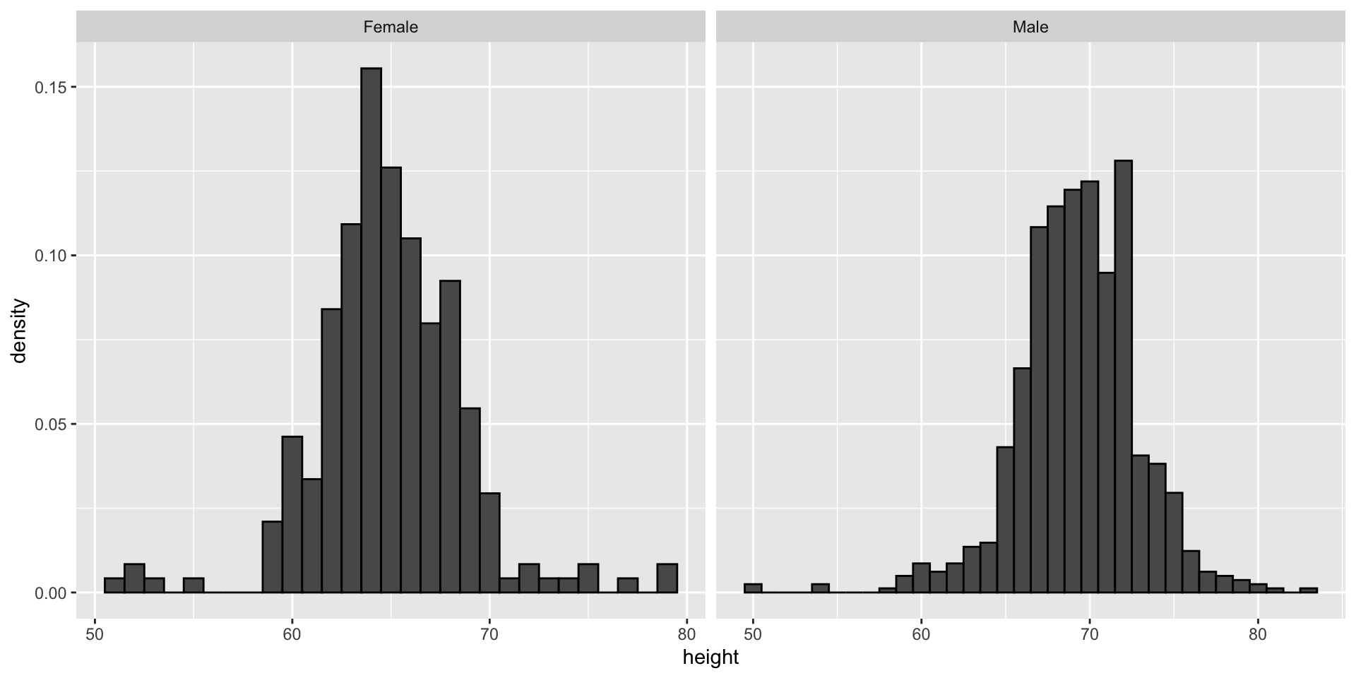
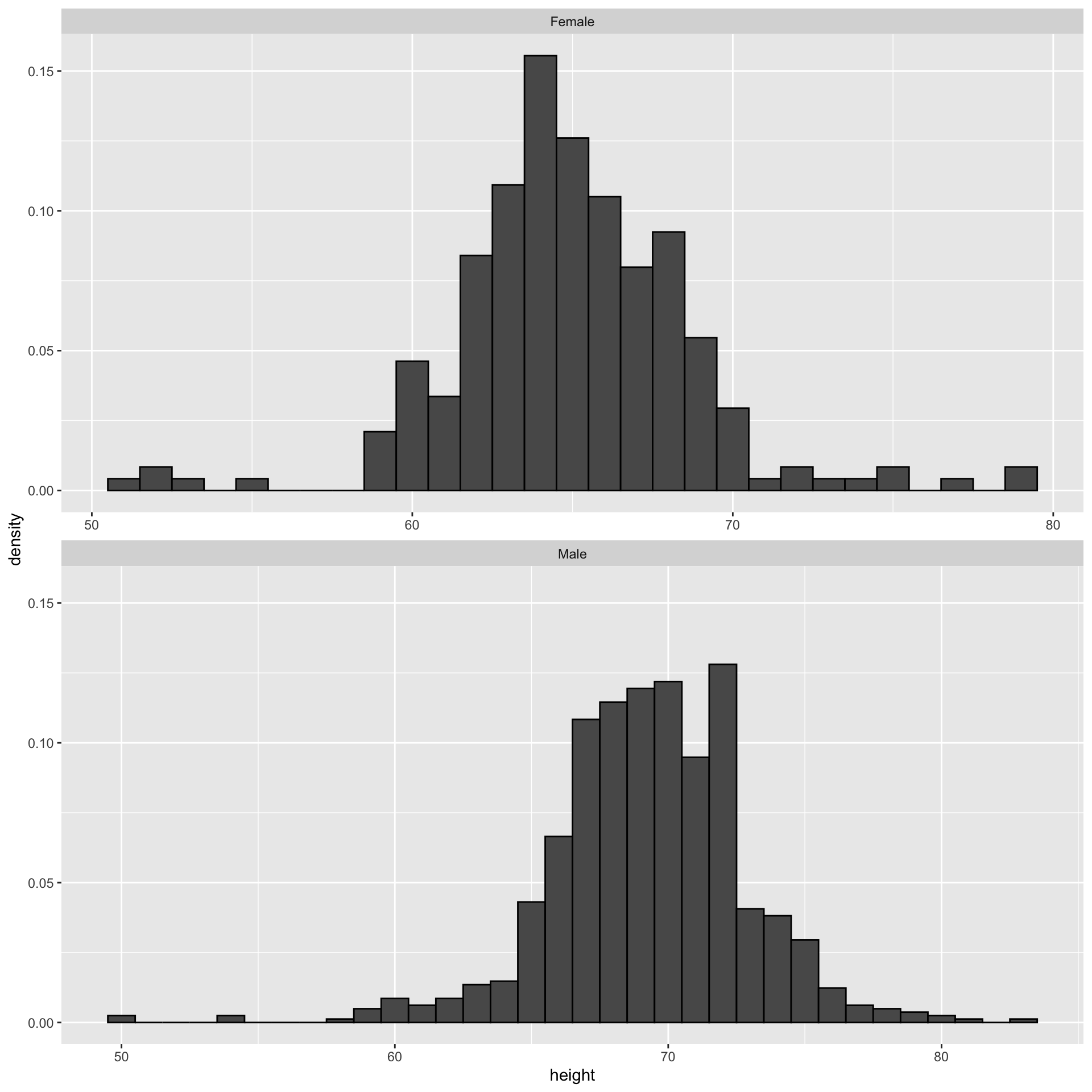
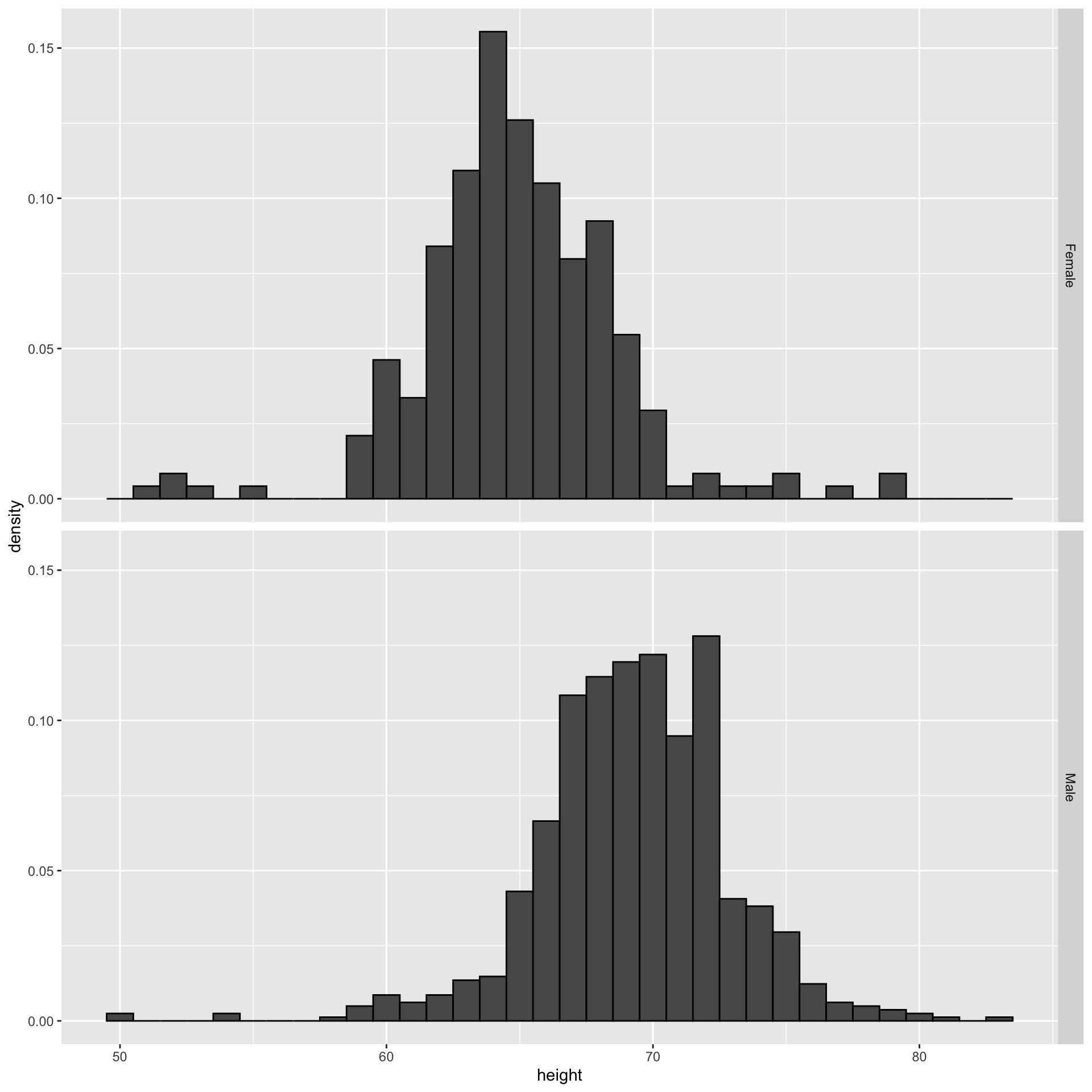
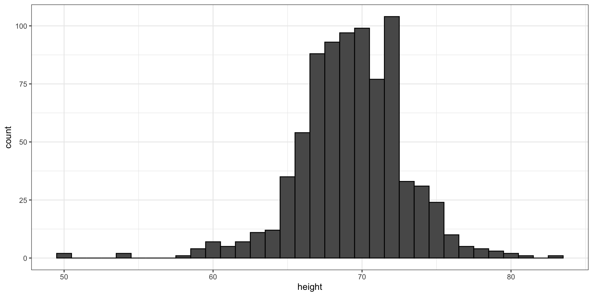
Histograms
Here is the histogram for the height data splitting the range of values into one inch intervals: \((49.5, 50.5]\), \((50.5, 51.5]\), \((51.5,52.5]\), \((52.5,53.5]\), \(...\), \((82.5,83.5]\).
From this plot one immediately learn some important properties about our data.
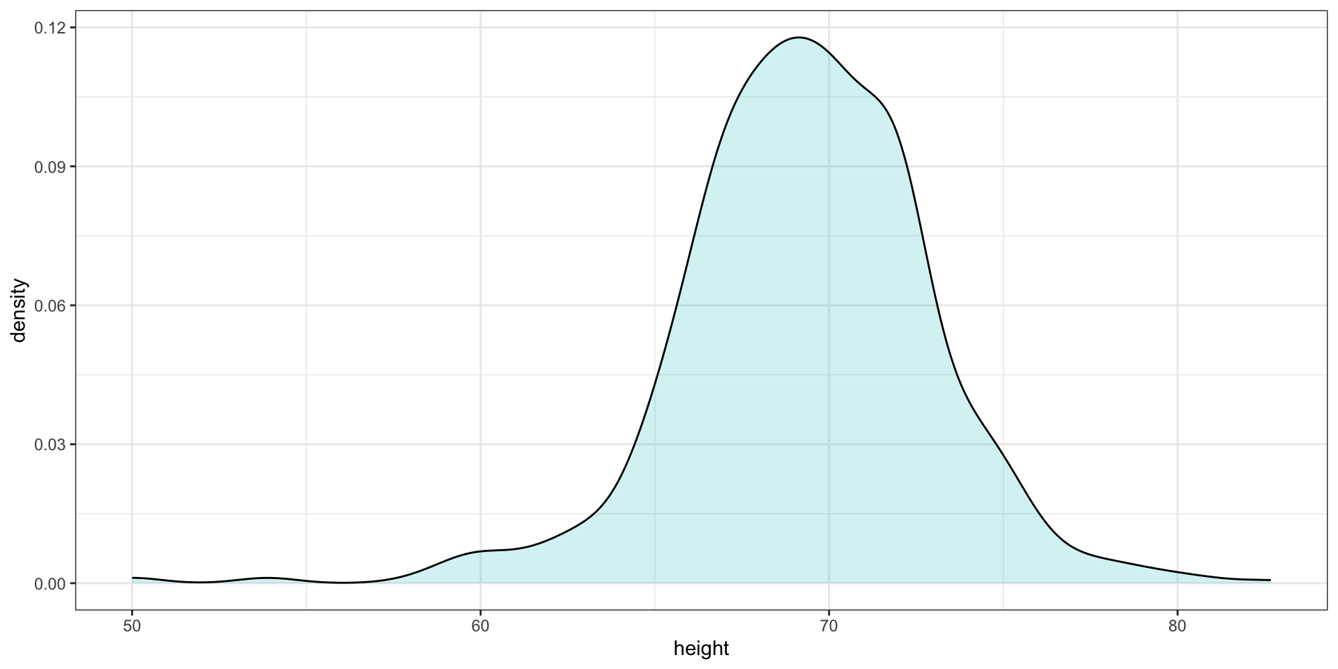
Smoothed density
Smooth density plots relay the same information as a histogram but are aesthetically more appealing:
Smoothed density
In this plot, we no longer have sharp edges at the interval boundaries and many of the local peaks have been removed.
The scale of the y-axis changed from counts to density. Values shown y-axis are chosen so that the area under the curve adds up to 1.
To fully understand smooth densities, we have to understand estimates, a concept we cover later in the course.
Smoothed density
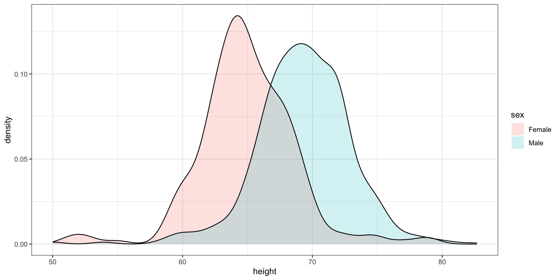
Here is an example comparing male and female heights:
The normal distribution
Histograms and density plots provide excellent summaries of a distribution.
But can we summarize even further?
We often see the average and standard deviation used as summary statistics
To understand what these summaries are and why they are so widely used, we need to understand the normal distribution.
The normal distribution
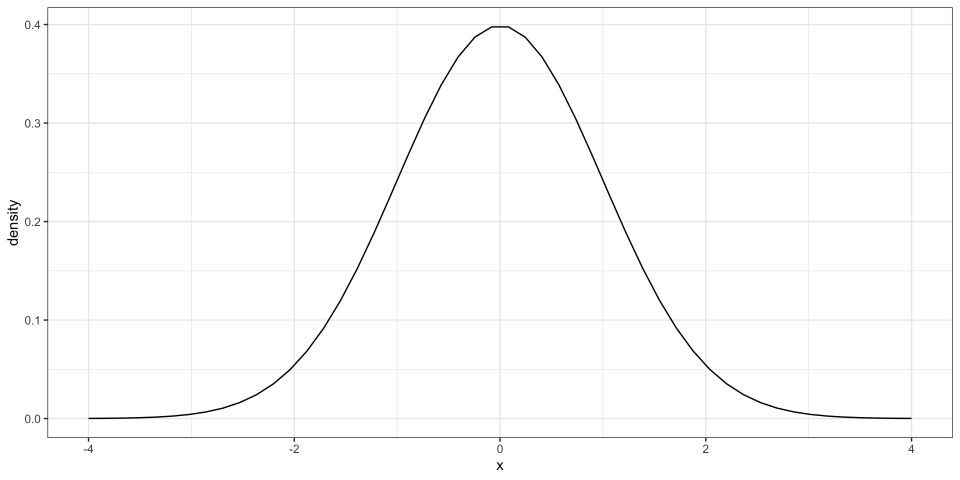
The normal distribution, also known as the bell curve and as the Gaussian distribution.
The normal distribution
Many datasets can be approximated with normal distributions.
These include gambling winnings, heights, weights, blood pressure, standardized test scores, and experimental measurement errors.
But how can the same distribution approximate datasets with completely different ranges for values?
The normal distribution
The normal distribution can be adapted to different datasets by just adjusting two numbers, referred to as the average or mean and the standard deviation (SD).
Because we only need two numbers to adapt the normal distribution to a dataset implies that if our data distribution is approximated by a normal distribution, all the information needed to describe the distribution can be encoded by just two numbers.
A normal distribution with average 0 and SD 1 is referred to as a standard normal.
The normal distribution
For a list of numbers contained in a vector x:
index <- heights$sex =="Male"x <- heights$height[index]
the average is defined as.
m <-sum(x) /length(x) # or mean(x)
and the SD is defined as:
s <-sqrt(sum((x - m)^2) /length(x)) # or sd(x)
Warning
sd(x) is the sample standard deviation which is not exactly the same as the standard deviation.
For reasons explained in later,sd divides by length(x)-1 rather than length(x) can be used here:
n <-length(x)sd(x)^2*(n -1)/n -sum((x -mean(x))^2)/n
[1] -3.55e-15
The normal distribution
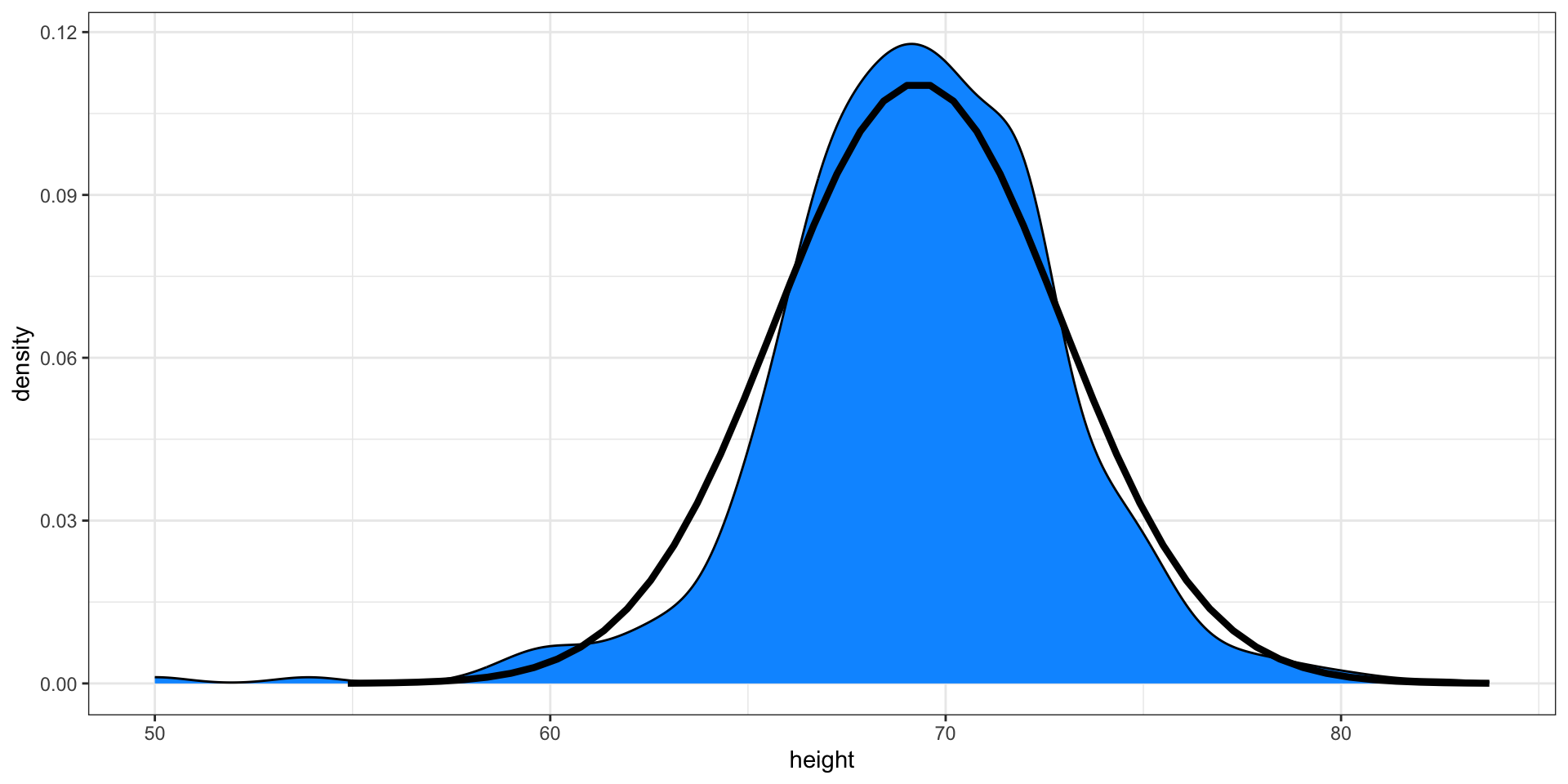
Here is a plot of our male student height smooth density (blue) and the normal distribution (black) with mean = 69.3 and SD = 3.6:
Boxplot
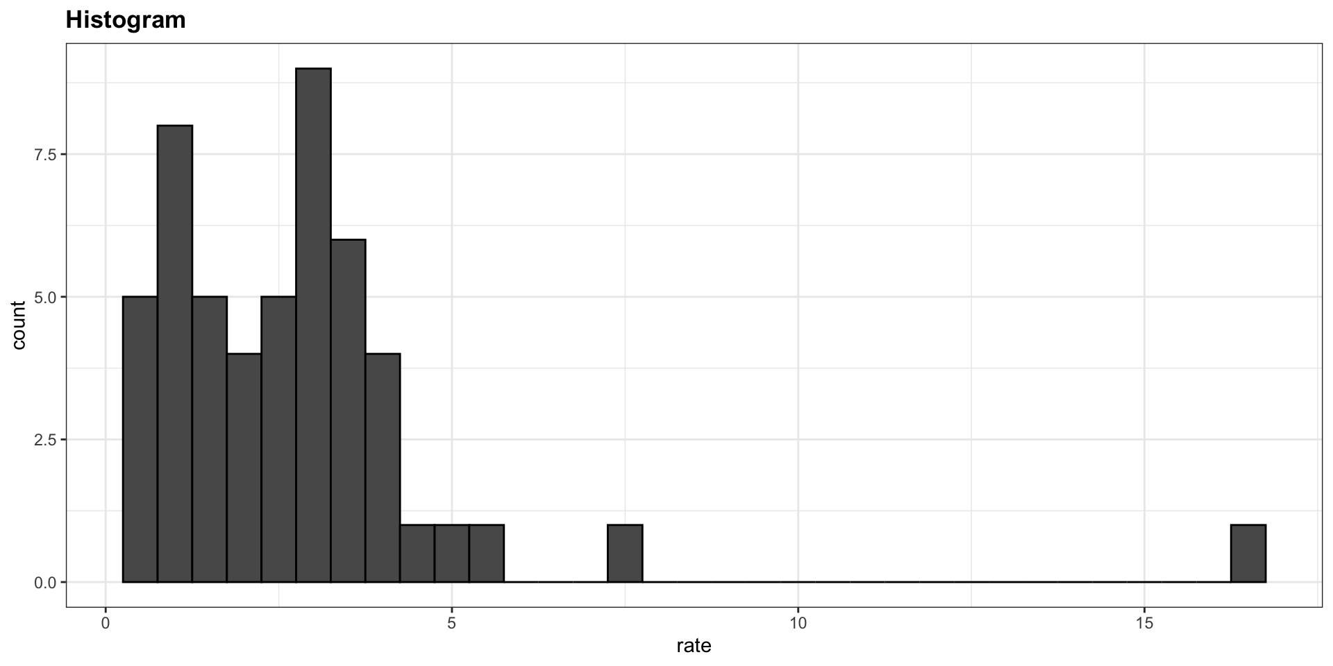
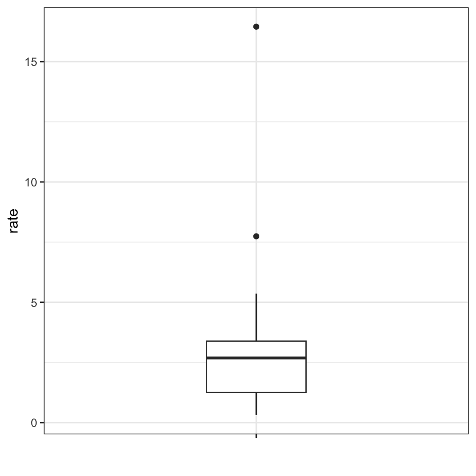
Suppose we want to summarize the murder rate distribution.
Boxplots
In this case, the histogram above or a smooth density plot would serve as a relatively succinct summary.
But what if we want a more compact numerical summary?
Two summaries will not suffice here because the data is not normal.
Boxplots
The boxplot provides a five-number summary composed of the range (the minimum and maximum) along with the quartiles (the 25th, 50th, and 75th percentiles).
The R implementation of boxplots ignores outliers when computing the range and instead plot these as independent points.
The help file provides a specific definition of outliers.
Boxplots
The boxplot sumarizes with a box with whiskers:
From just this simple plot, we know that:
the median is about 2.5,
that the distribution is not symmetric, and that
the range is 0 to 5 for the great majority of states with two exceptions.
Boxplots
In data analysis we often divide observations into groups based on the values of one or more variables associated with those observations.
We call this procedure stratification and refer to the resulting groups as strata.
Stratification is common in data visualization because we are often interested in how the distributions of variables differ across different subgroups.
Stratifying and then making boxplot is a common approach to visualizing these differences.
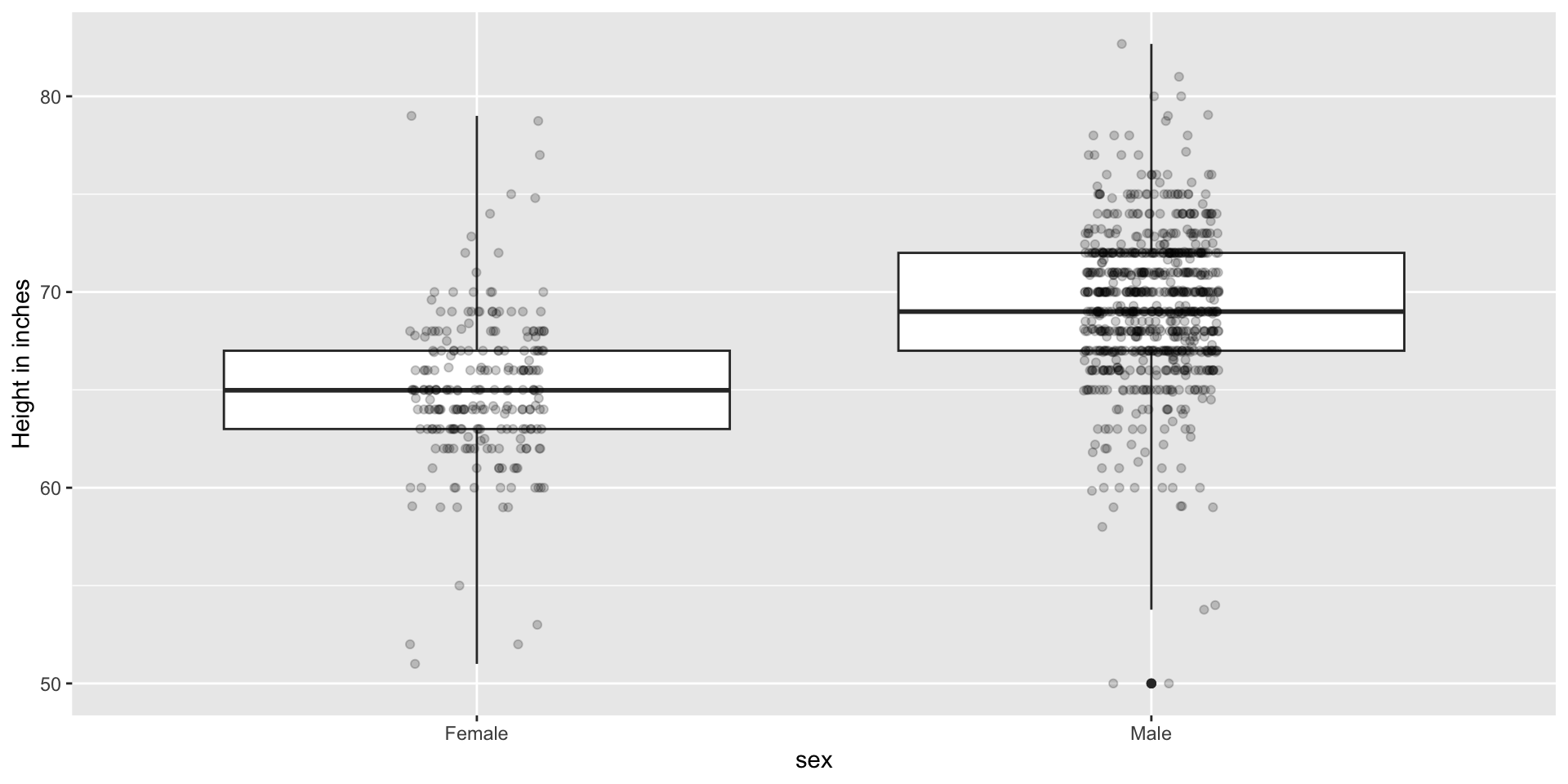
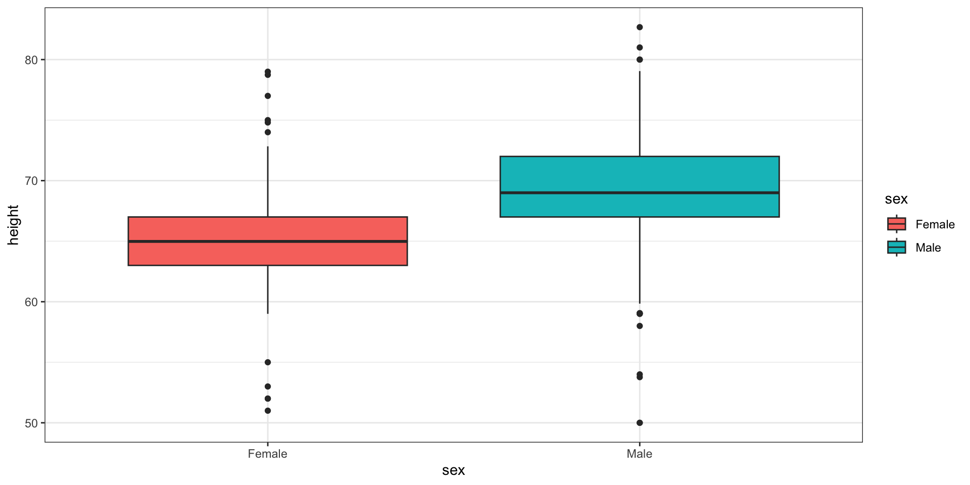
Case study continued
Here are the heights for men and women:
Case study continued
The plot immediately reveals that males are, on average, taller than females.
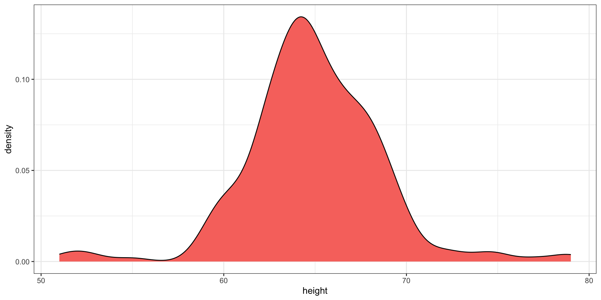
However, exploratory plots reveal that the Gaussian approximation is not as useful:
Case study continued
A likely explanation for the second bump is that female as the default in the reporting tool.
The unexpected five smallest values are likely cases of 5'x'' reported as 5x